In this post
This is post #1 in our Under the Data Tree blog series.
How long does it take CommCare users to reach a steady state of use? We expect that it will take the average user some time to get comfortable using CommCare and that most users require a period of time before they start using CommCare with all of their clients. How long this process takes is an important question because it can inform how to introduce mobile technology to frontline workers (FLWs). It can help programs plan their implementation timelines to allow sufficient time for users to get comfortable using their mobile apps before trying to expand further. Furthermore if we know what to expect, program staff can identify individual users who are exhibiting slow uptake of CommCare and can provide extra support and training for such users.
For this investigation, we’ll explore our data during the first year of CommCare usage. We analyzed about 630 users who have used CommCare for at least one year, including only those that submitted data for at least 10 months of their first year. We also randomly selected users from very large projects, so that no single CommCare project accounted for more than 10% of users.
Over the last fifteen years, feature phones capable of running third-party apps superseded basic voice-and-text devices. More recently, smartphone penetration has been increasing rapidly in the developing world. In particular, Android devices are now widely available in most countries, and over 10 million new smartphone connections were made every month in Africa during 2013 and 2014 (GSMA, 2014).
This post explores some mobile technology trends across a large number of projects using CommCare. The CommCare mobile app runs on both feature phones and smartphones. Data can also be collected via SMS or the web. This allows us to track trends and compare usage patterns across different technologies.
Users by device type, Jan 2010 � Sept 2014
(moving the slider zooms the timeline)
user_device_type_chart
Our data shows that Android is becoming increasingly dominant within five years since the release of the first consumer Android device in 2008. Looking at CommCare projects, we find that while in December 2010 there was one project using Android phones, in January 2011 there were 18, and in September 2014 there were 171. Most self-started projects (i.e. CommCare projects created by organizations themselves, without Dimagi involvement) chose Android � of the 63 currently active self-started projects, 55 (74%) use Android, while 14 (19%) use Nokia (the remainder use Dimagi’s Cloudcare web client or a mix of devices). For Dimagi-assisted projects, the percentages are 51% and 20% respectively. This is probably because installing third-party apps such as CommCare on Android devices is much easier than on Nokia feature phones.
In the maps below, we compare the percentage of CommCare users on Android by country for September 2012 and September 2014. Although Android predominates by 2014, there are still a significant number of Nokia users in East Africa (Kenya, Tanzania, Mozambique, Zambia) as well as in India. This coincides with the location of the earliest CommCare projects, which started with Nokia feature phones before Android phones were widely available in the region.
Android users by country (%), Sept 2012
sept_2012_android_percent_map
Android users by country (%), Sept 2014
sept_2014_android_percent_map
The data also allows us to compare usage patterns for Nokia and Android such as the number of forms and visits per month, since multiple forms might be completed in a single visit (e..g forms for both a mother and baby). In the table below, we compare Nokia and Android users in their sixth month using CommCare.
Usage patterns for users in their sixth month on CommCare, Nokia v. Android
| Nokia | Android | |
| Total users active for at least 6 months | 1172 | 1532 |
| Total domains | 55 | 117 |
| Median forms submitted in month six | 17 | 38 |
| Median visits completed during month six | 12 | 24 |
| Median percent of days in month six that the user submitted data | 4 | 7 |
| Median cumulative time the user spent completing all forms (hours) | 1.25 | 3.01 |
| Percent of users that submit data in both month six and month nine | 86.09% | 73.30% |
From this, we can see that Android users do seem to complete more forms and more visits than Nokia users. They are also active more days of the month, and spend more time on CommCare. Retention three months later (i.e. at 9 months) is high for both groups of users.
A Kruskal-Wallis non-parametric test on means by domain confirms that the device type differences for median number of forms, visits, percentage of days of the month in which the user submitted data, and time using CommCare per user in their six month are significant (p < .05 for the first three, p < .01 for the last). There isn�t a significant difference in the median percentage of users who submitted data in both month six and month nine.
Conclusions
Overall, the findings suggest that Android users generally have higher volume and more frequent usage. However there are a number of other factors to consider. It may be that projects with a larger budget for devices (allowing them to choose the more expensive Android devices) also have more money to spend on training and supporting remote workers. Outcome measures based on the number of forms or visits also don’t consider the content of the interaction, which may involve a lot more than just data collection. Nokia devices have better battery life, are more durable and often easier to learn for users without smartphone experience. They work well for projects with mobile workers and clients in particularly remote areas, where greater travel time may account for fewer visits. Given that retention rates at nine months for users active at six months are not significantly different, the data suggests that established users are not particularly sensitive to device type choice.
Perhaps the most reasonable conclusion is that technology does matter, but not necessarily the way we might think. New technologies have new features and new possibilities, but aren’t necessarily suited to every situation. Nokia feature phones designed for use in the developing world are rugged and resilient, and few smartphone models can match them. Android phones are better for multimedia and location capture applications, and generally have a better user experience for high-volume users.
" data-medium-file="" data-large-file="" class="wp-image-176243634 aligncenter" src="https://files.dimagi.com/wp-content/uploads/2014/12/UE-Image-1-e1418194149641-620x611.png" alt="UE Image 1" width="375" height="371"/>Figure 1: Median number of cases visited per month of CommCare use
The above graph (Figure 1) shows how many different cases are visited (either registered or followed-up) in each of the first twelve months of usage. Note that this shows the median of all users in their first month, second month, etc., regardless of when they actually started using CommCare. We can see a steady increase in how many cases were visited over the first six months of usage before it levels out.
In order to get a more detailed look at patterns of behavior as users gain experience with CommCare over the first year, we broke down each user’s performance by quarter. We averaged their first 3 months of activity levels and called that Q1, months 4-6 activity levels averaged to become Q2, and so on for the first four quarters. We then looked at how user behavior changes from quarter to quarter.
We see a median increase of 22.9% in the number of cases visited in our users’ fourth quarters (Q4) compared to their first quarters (Q1). The mean increase from Q1 to Q4 was 96%, implying there are some users who showed very large increases. The table below shows the median and mean percentage changes between each pair of quarters.
Table 1: Median and Mean Change in number of cases visited between different intervals
| Median Change | Mean change | |
| Change from Q1 to Q4 | + 22.9% | + 96.0% |
| Change from Q1 to Q2 | + 17.8% | + 79.4% |
| Change from Q2 to Q3 | + 1.9% | + 23.1% |
| Change from Q3 to Q4 | + 0% | + 14.9% |
Between Q1 and Q2, there is a substantial increase in the number of cases visited (median % change = 17.8%), but the median % change between Q3 and Q4 dropped dramatically to 0%. From this trend we can infer that in general it takes approximately 6 months for the median change between quarters to reach 0.
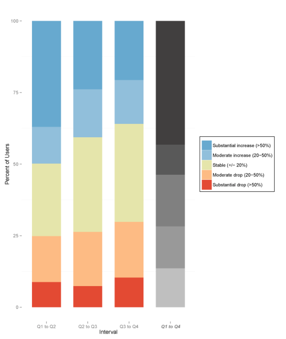
Figure 2: Percentage change in number of cases visited by intervals between quarters
The above graph provides more detail about patterns of user behavior between quarters. It shows how many users have substantial or moderate changes in activity levels between quarters. For example, even though the median change from Q3 to Q4 is 0%, about 20% of the users show an increase in activity of 50% or more, and about 10% show a decrease in activity of 50% or more. These graphs show that there is a good deal of variety on the user level, but with the average rate of change reaching a steady state within six months. Specifically by the Q3-Q4 interval, there is a larger portion of users who remained within 20% of their prior month’s activity. In order to understand when or if an average user reaches a steady state, we will need to look at user-specific patterns of change over time, something we hope to tackle in upcoming blogs. The data presented here suggest that there may be quite a bit of variation over time for many users.
We were also gratified to see a general upward trend in the activity level of users as they gain more experience with CommCare. We have been assuming that this reflects increased capacity to use CommCare. However, one of the potential benefits for a program to adopt CommCare is to increase the coverage of that program. It may be that the users are indeed becoming more active and seeing more clients. It may also be that it takes programs some time to learn how best to support and supervise their users, and so the time it takes for new users to ramp up will decrease as the program gains overall experience implementing CommCare.
As we accumulate more CommCare data we will also be able to look at a longer time horizon and see what happens to the average number of cases visited over 1.5 – 2 years. In addition we hope to dive further into other aspects of worker experience, such as amount of time spent on CommCare, use of audio files, etc. This should help plan mHealth deployments for FLWs, as well as help plan for and identify individual users who may need extra help or more time to reach steady state.